PHIA Advisors
BRANDING
NAMING
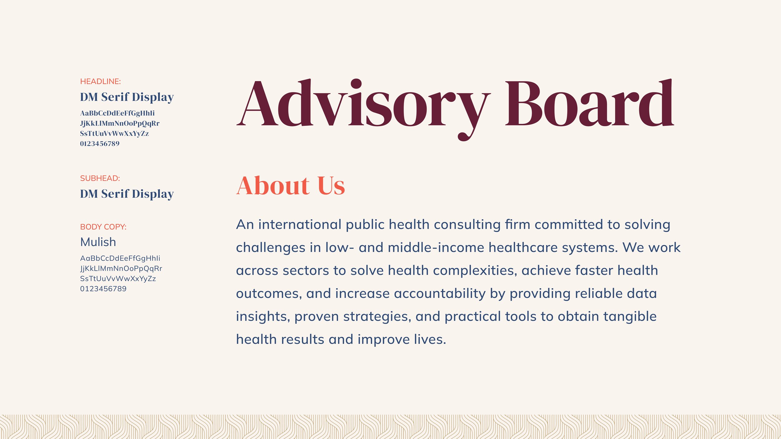
PHIA Advisors serves as an international public health consulting firm committed to solving challenges in low- and middle-income healthcare systems; specifically, leading with the goal of offering modern healthcare services to women in Africa. Our collaboration centered on creating a brand identity that balances professionalism with a feminine touch, appealing to both African women and global legislative leaders.


PHIA Patterns
Partnership
The partnership pattern consists of an angular link motif to symbolize the agreed commitment toward responsible work. The pattern’s weight symbolizes the strength and support of partnering together.
Human-Centered
The human-centered pattern consists of a tiered radial graphic that simultaneously branches outward and inward. Similarly to how advising on healthcare is a conversation between both patients and industry professionals, one group will always inform the other. This pattern symbolizes a focused approach to
human-centered healthcare solutions.
Community
The community pattern consists of a fluid
root-like motif to symbolize the ever-evolving and uplifting qualities of a community. The edges loosely resemble hands raised to the sky supporting one another.


